Test
01
02
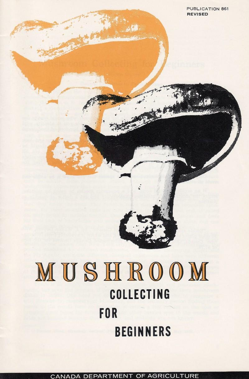
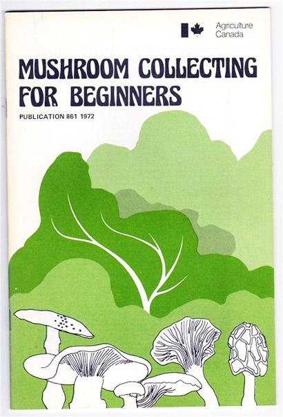
I laughed when I found this…the idea of government inspired materials being produced to help beginners collect mushrooms, seems odd to say the least. The activity and content aside, this cover’s use of trippy text, organic colours and album art graphics reek of early seventies. The habit of most federal government design is typically stiff and grid like (which I love) but some departments, who commissioned work that was outside the canon, avoided this. The more digging around I do, it seems that the agriculture department led the revolt in not using the Swiss rulebook. There are some great off the wall work that came from here and I will try to dig up some other great examples. -Todd Falkowsky
03
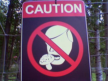
What other place in Canada could produce such a sign? I found these signs posted in most parks in Vancouver and surrounding area, warning against the eating of mushrooms (all kinds). I thought that it was funny for a few reasons, but mostly that it is a caution rather than a strict forebidding. The group I was with wanted to steal them and transplant them to High Park and other green spots in Toronto for a gag. Dope, mushrooms and fleece, what a fantasy land, remind me again why we live in Toronto!
04
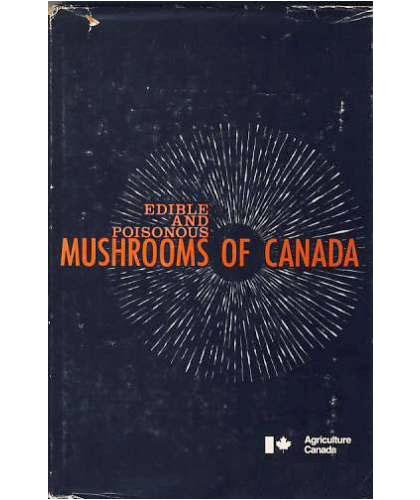
Edible and Poisonous Mushrooms of Canada Cover
Client
Agriculture Canada
Year
Category
Poisonous test
