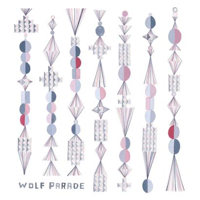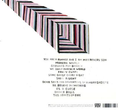


I’ve always appreciated this cover. The way simple repeated elements and a subtle use of colour give a suggestion of intricacy to Matt Moroz’s intentionally naïve style. It’s a nice balance and great metaphor for the music itself.


I’ve always appreciated this cover. The way simple repeated elements and a subtle use of colour give a suggestion of intricacy to Matt Moroz’s intentionally naïve style. It’s a nice balance and great metaphor for the music itself.