
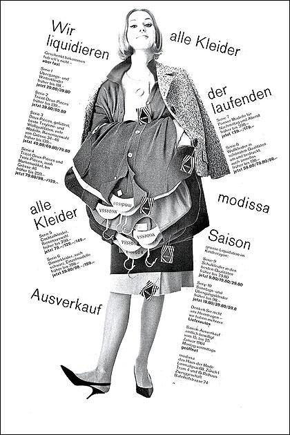
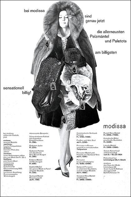
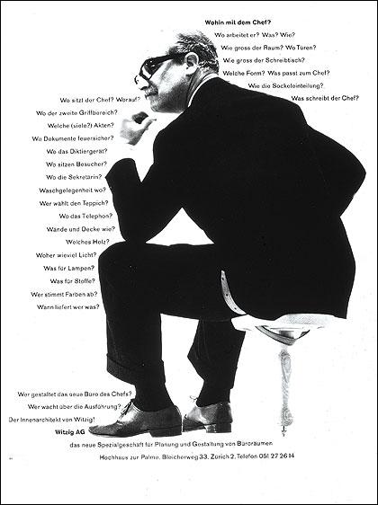

Erie ZF, Retailer Information Packs, 1962 Witzig Office Furniture, Newspaer Ad, 1962 Modissa, Newspaper Ad, 1963 Modissa, Newspaper Ad, 1963 I see so-called Swiss Design as an amalgam of Dutch de Stijl, German Bauhaus, Russian Constructivism and Middle European design. The Swiss took in all of these important influences and with ‘stubborn’ single mindedness made it all ‘tick-over’ like a fine Swiss watch. This took time: the Swiss were not burdened by the kind of ‘here today, history tomorrow’ faddishness so prevalent in the United States. My own direction evolved into a mix of American Bravado, Swiss mathematical precision, what is often referred to as ‘minimalism’ (a misnomer when ‘less is often more’) and an ongoing interest in the optical graphic art of Albers, Grignani, Vaserely, and others. I made use of grids, but never followed one slavishly, discovering that things ‘came to life’ when a consistent system was suddenly broken. As a result, I came to an interest in multiple or variable grids, which allowed for heightened drama, where required. Simple rules like “There is no small without large; there is no large without small” emerged. Along with all of the foregoing, I maintained an ongoing, intense interest in the use of colour to communicate mood, or what Paul Rand referred to as ‘local colour.’ – Burton Kramer