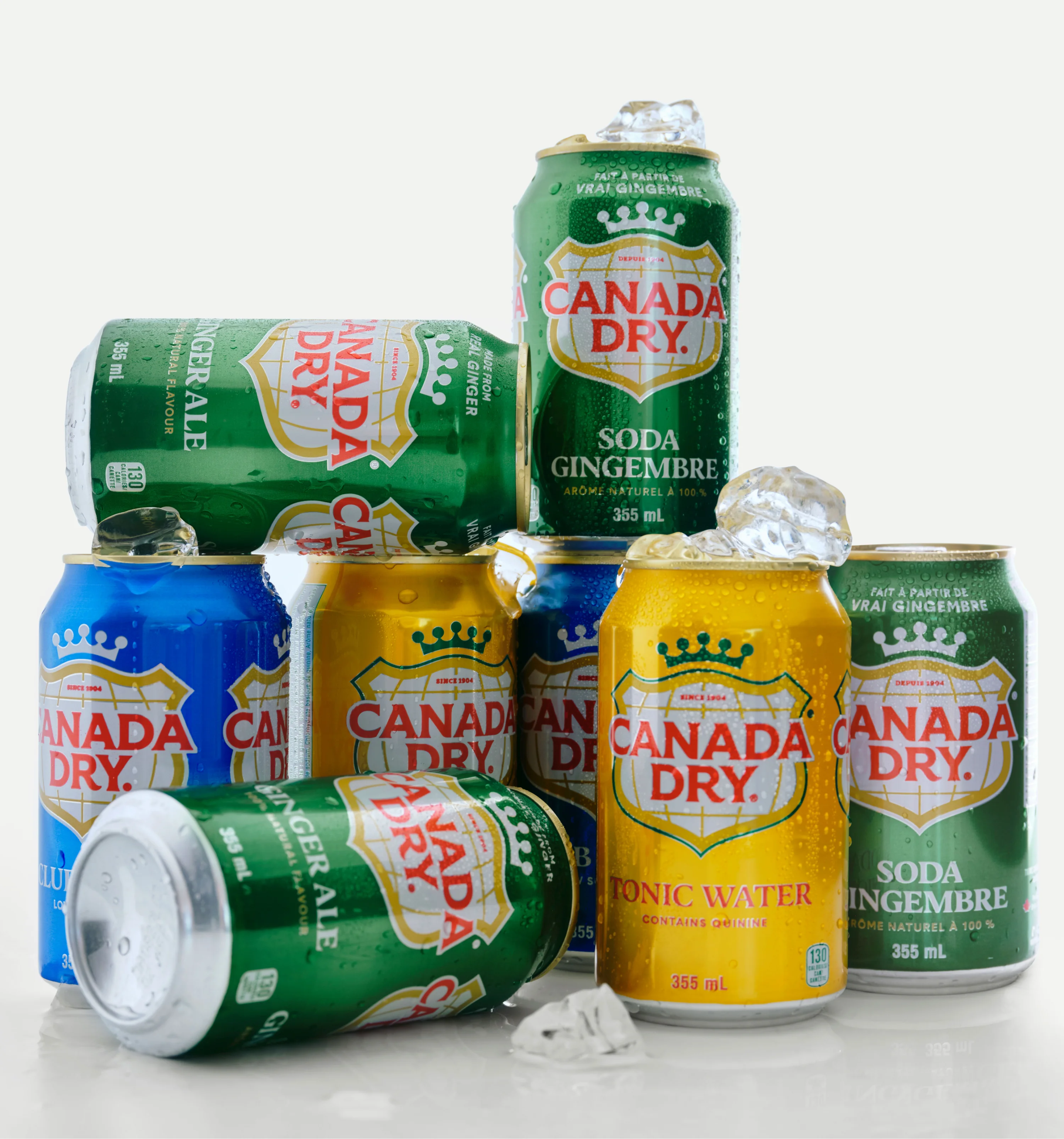

"How do you evolve a beloved, 130-year-old beverage brand and packaging family for the modern world? You start by studying its history. The iconic elements that people know and love, worldwide. The main design challenge was for the brand and packaging system to be refreshed in a current manner, while respecting a longstanding legacy. Our brand team reviewed hundreds of archival brand specimens, advertising, and packaging to inform the new work, to land a seamless transition between the past and the future.
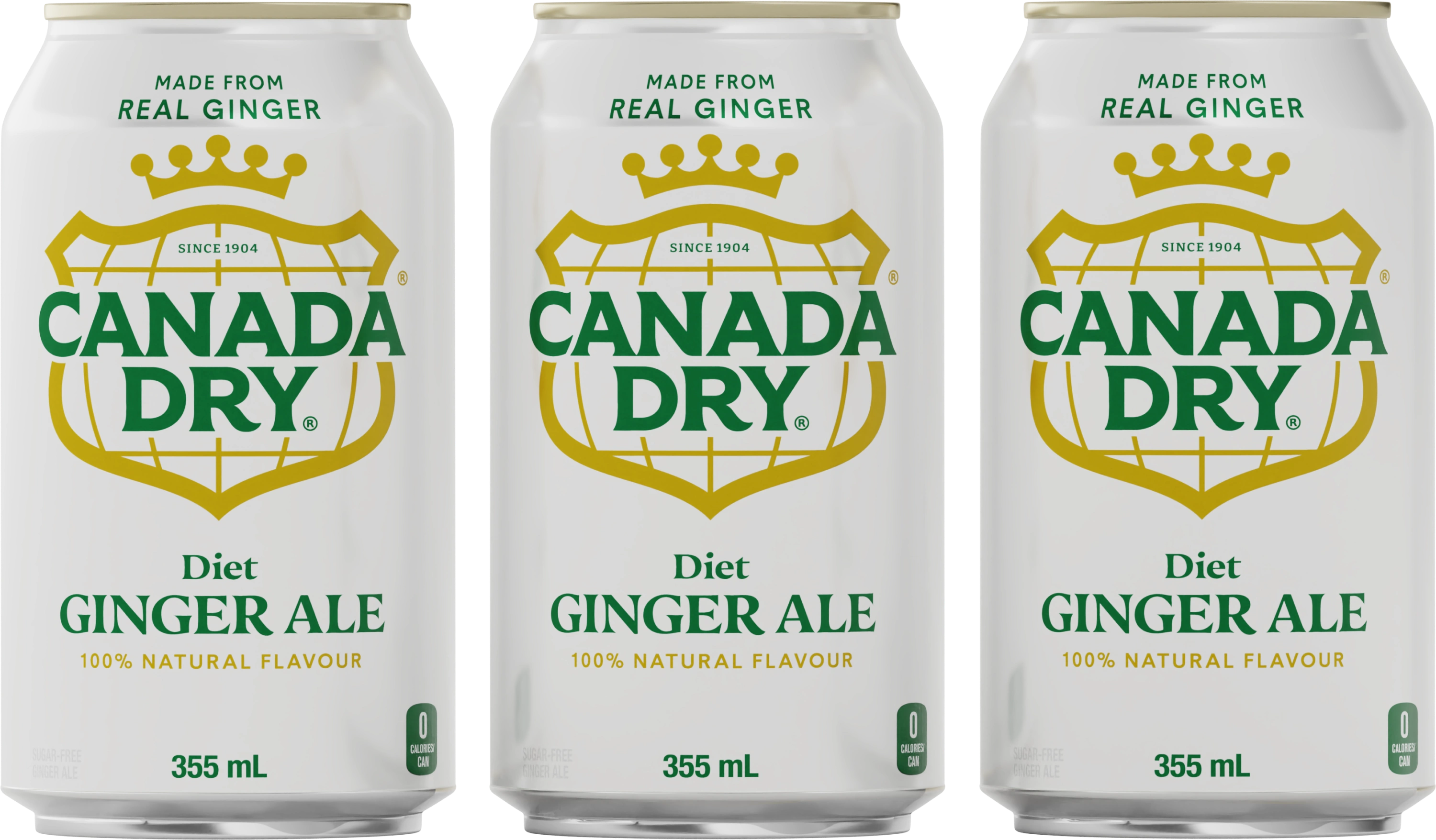
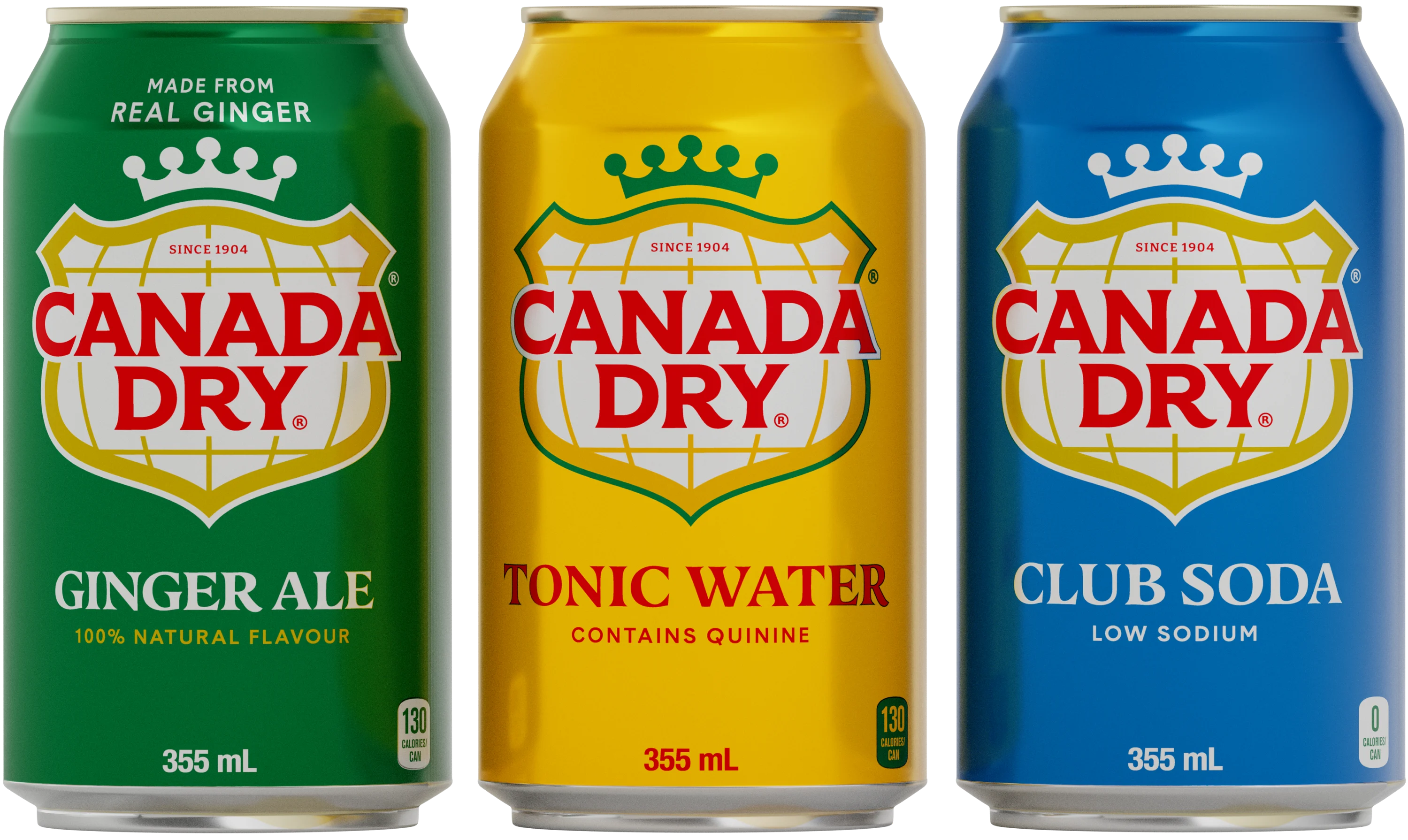
The refresh is anchored in a few key brand attributes: Signature Color, Badge, Crown, and a newly designed, custom Wordmark. Our team thoughtfully strengthened each component with sensitivity to the legacy, awareness of modern category cues, and mindfulness of the complete family.
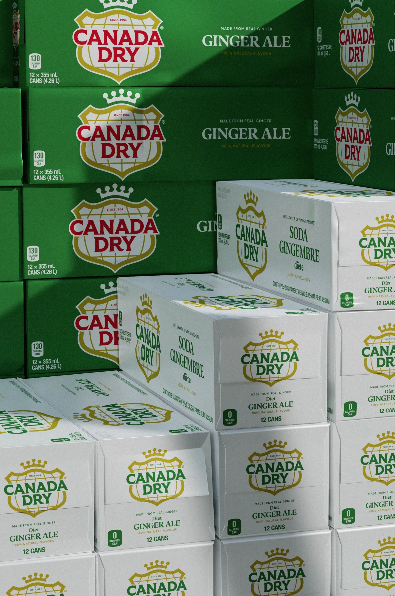
The result is a modernized, cohesive, and flexible design system across a complex range of 50+ different SKUs. Consumer research revealed that the new design was easier to identify on shelf due to its iconic simplicity. Somehow it felt unchanged because it felt so right."