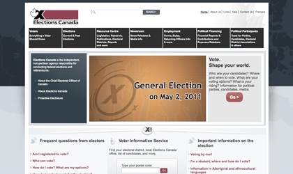
Here is a freebie, not quite connected to the political parties but still a part of the overall design of the elections. Not much to say about this…hard to navigate, poorly laid out, too much black (and lousy use of colour), no consistency, and barely applying the Gov. style guide. WAKE UP CALL – Governments of Canada, there is a thing called design, start to use it!
Comments
DemocracyDingoApril 14, 2011
Wow CDR! Nicely done – your whole first page is dedicated to the election. Nice to see you be so engaged and showing us what is going on design-wise.
Unfortunately it isn’t highlighting too many examples of “good” design. There is obviously still a lot of design education that needs to happen here. I guess we can still wax poetic about the good old days of the ’67 Centennial and the ’76 Olympics…what the heck happened?
scApril 14, 2011
Design-critic wankery at its finest! Allow me to [fisk](http://en.wikipedia.org/wiki/Fisking) this for you:
_> Not much to say about this…_
Really? You sure fooled me!
_> hard to navigate_
Like most of the internet, the site isn’t _perfect,_ navigation-wise…but considering that elections.ca is necessarily (and quite _beneficially_ here, I might add!) design-by-committee to serve a ridiculously diverse range of constituents and purposes (unlike, say, nfb.ca, which has a much narrower focus), it’s among the better Government of Canada sites I’ve seen.
The key example here? As a voter – undoubtedly, the most common type of visitor to the site! – I was able, from the main page, to simply and quickly enter my postal code to find the all essential details about my district (including where, when, and how I vote), _plus_ a useful FAQ with more detailed info.
Try it yourself. How could that be any easier, or any _more_ user-friendly?
_> poorly laid out_
…For whom, exactly?
Info for the average voter – including a big, easy-to-find “Go” button! – is front and centre; and secondary info (such as employment opportunities) is just below that. Plus, there’s a prominent search bar and several detailed (but not overwhelming) menus also, if you’re looking for something more specific.
The only place that the information hierarchy starts to fall apart is with the _“I am a:”_ drop-down menu at the bottom left, which could be more clearly labelled for all the other, less common types of site visitors.
_> too much black (and lousy use of colour)_
I’d normally skip past something this petty, but since this seems to feed the heart of your critique, it’s worth exploring in some detail:
Yes, the colours are bland, they don’t go too well together, and the site is largely atonal. But in this context, that’s _mostly_ a good thing! Why? Because:
– most bright colours are obviously and unavoidably associated with individual Canadian political parties, so using them here would potentially risk the appearance (or even the effect!) of displaying a partisan bias…
– …and on the flip-side, many _other_ colour schemes (e.g., pastels or earth tones) could inappropriately suggest a demographic, economic, or other social or cultural bias;
– semantically, “bland/monotone” equals “mature,” “unsurprising,” and most importantly “trustworthy” (a.k.a.: “facts over flash,” “information in black-and-white”), which is the crucially important impression to convey here;
– and of course, the high visual contrast of black on white (or vice versa) also improves readability for those with visual problems or disabilities.
And on all three counts, what you’re claiming as an “overuse” of black(?!) is a textbook example of design as context-appropriate communication, and of form following function.
(That said: Yes, I do think there are more aesthetically pleasing colour combinations that could serve the purpose here also. But considering the _purpose_ of this site, I’d argue that’s the least important part of its design.)
_> no consistency_
I can only assume you mean “aesthetically” here, also…because _functionally,_ the site is consistent with nearly _every_ usability practice that I know of.
On the main page, for example: The logo at the top left. The prominent search bar to its right. A nav menu below that. The most important information on the page below that, big and highly clickable. And so on. All these things are _consistent with online convention_ (which is to say: “exactly where a first-time visitor expects them to be”), and that makes the site extremely easy to use.
_> and barely applying the Gov. style guide._
I’m personally unfamiliar, so I’ll have to take your word for that. But nonetheless, I can fairly safely assume that my ignorance works in your favour. Because, c’mon: Does the government style guide have any restrictions on the amount of black? And does it spec “maple-leaf red” which, in this context, would become “Liberal red”?
_> WAKE UP CALL – Governments of Canada, there is a thing called design, start to use it!_
I agree that elections.ca isn’t as well designed as, say, the average Dutch government website. And yes, it’s ugly.
But what I can’t tell in your little rant about it is: what’s your preferred design solution for it? To just Karim Rashid it up?
Because the point I’ve tried to make here – in several different ways – is that in spite of your shallow and overstated critique, a _lot_ of things about elections.ca are designed quite well…because **design is more than just decoration.**
(And to briefly stoop to the tone of your “wake-up call”: considering that clicking on the CDR’s own header _didn’t_ bring me to its home page until only _quite_ recently, perhaps you should look into that difference yourselves!)
njkApril 15, 2011
I’ll admit to only having skimmed the above comment, but I will say that I’m with him on at least one thing….. You gotta do something about that header.
Todd FalkowskyApril 15, 2011
Working on it! I know we have a tanker but are getting a new site sorted that will launch this spring. Check back often and keep the comments flowing.
ONa HeadMay 7, 2011
I was employed by Elections Canada for over a month.
I believe Elections Canada should look into simplifying the process. Having the area/street postal code come up automatically for instance and review the computer program to simplify it. It seems that there is a huge waste of paper, too.
By having an automatic vote counter at each site could eliminate error and speed up the process. Less people would need to be employed.
Training sessions for people working on voting day should include a test for printing clearly and ability to count accurately. I suggest the DRO and the Poll Clerk count the amount of ballots together before voting begins. Too many ballot books had one or two missing and the DRO was the only one to do the count of the book ballots.
At the end of Election day there needs to be at least 5 to 6 people answering the phones at the central office to record the vote from different poll sites. One or 2 people isn’t enough.