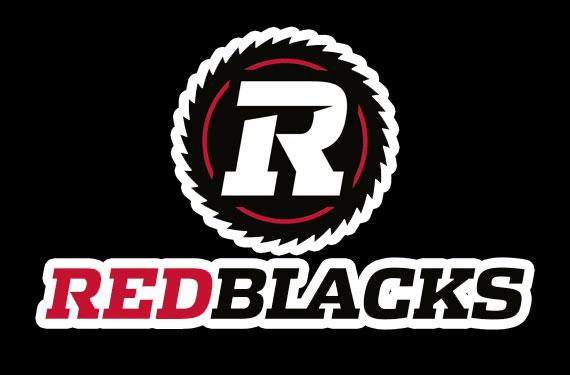
In response to the unusual situation of two teams having the same name, in the same league…with only eight teams playing, the Ottawa franchise decided to make a change from Roughriders to Redblacks.  It is unclear on how the creative work was generated but like most contemporary sports organizations in the country design has taken a back seat to marketing, with the predictable poor results. In a statement Jeff Hunt, president of Ottawa Sports and Entertainment Group explains the meaning as “a tribute to the Ottawa men and women who serve our country,”  and as a nod to the “ceremonial colours of Ottawa’s Cameron Highlanders, the Governor General’s Foot Guards and the RCMP”. He feels that that the new identity is “unique, maybe even a little edgy, and it’s a brand that we think will stand the test of time”. Ottawa CFL fans are not happy with the name (offensive) or the identity (which will never win a design award or produce popular swag) and have been complaining loudly on social media sites and others. A very loud gong is ringing in Ottawa this fall…

Comments

Hanrye TSeptember 17, 2013
This is garbage. The type is exploded and undesigned, with little black specks where the letters did not get bolded well. What a massive dissappointemt.
JohnSeptember 17, 2013
Why are Canadian sports teams getting all army and supporting the troops? Is this little America? We can promote something positive but marketing fools pull us in this direction.
Janis RegentSeptember 17, 2013
Barf, this actually makes me sad. It make Canada looks so bush league. My high school had a better logo design. Who did this, Jeff Hunt’s kid? What an absolute joke. Please do not buy season tickets or swag.
Carey S.September 17, 2013
Sorry that I had to see this today. The name is actually offensive, where these owners deaf to the loud complaints about other sports team names in the states (Red Skins, Indians, etc)? Big business, design and sports do not seem capable of working together.
Gary HunterSeptember 17, 2013
The Jets with their army shit and now this! We are becoming Harperland, with rich white people spoiling our national identity. What a sad day for design in Canada and for sports in Canada.
SteveSeptember 17, 2013
Anyone who reads into this as offensive is ridiculous. Redskins – yes, absolutely. This? No. No way. Has no association with aboriginals whatsoever. However, the name as a whole is pretty terrible. And yes, the overall identity was poorly thought out and not only that – it was farmed out to an American design firm. There was a pitch done locally to name the team the Highlanders. Granted, it was spec work and we all have our opinions there, but it was a much better name and much better identity in my opinion. Here it is, by Le Collectif: <https://twitter.com/Le_Collectif/status/260371097055264768>
Wallace CorningSeptember 17, 2013
Darn, this should have been great. The design looks like it came from a crowdsourced site. NO kerning, the bold is incomplete and does not fill in the white spaces (little black flecks), the repeated R, the buzz saw does not look like a saw but some abstract flower. This is very very very weak.
Todd FalkowskySeptember 17, 2013
We agree with some of the above, this is not a classic logo by any stretch, and it does little to advance the mission of design in Canada. Hopefully the backlash will get loud enough that they rethink this next year. NOTE TO SPORTING TEAM ownership – hire designers, it will add up to increased attraction and sharing. Good design sells and makes fans. Bad design makes enemies.
Privacy
Terms of Use
API
Problem with an entry?