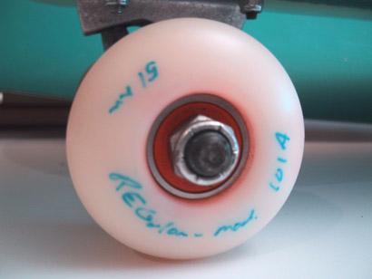

[!skateboard-wheel-design.jpg]() European skateboarders faced a unique obstacle that the well known North American manufacturers didn’t cater to, downtown’s filled with cobblestones and irregular brick streets. Market gaps like this, created a way for European skate brands to compete in a crowed marketplace with specific products, produced in small runs, that addressed local conditions. This small batch, skateboard wheel was designed with a better shape/tread and hardness, helping them to roll better on the rougher surfaces that make up much of the European streetscape. Instead of sticking and locking on the irregular bumps, these bounced along, with the confidence of a hard wheel and the comfort of a soft wheel. The multi-layered, mixed urethane mixture was custom spec’ed through an English company that creates bushings for Formula 1 cars (read stupidly expensive and over the top tolerances) and brought high technology to the street. To increase the value for riders, the wheels came with a custom orange (the official colour of Holland) coloured ABEC bearing set, installed at the factory where the wheels were cast and machined, which increased the tolerances and overall performance and durability. The end product was expensive and forced to become a limited edition (50 sets), with every wheel having it’s size/shape hand written on the sidewall by the designer, which gave the sets a handmade value that production wheels lack. Additionally the wheels were stripped of the usual Rues blue wooden shoe logo, relying instead on “word of mouth” to advance the story instead of slick marketing. Two years in development, these were the most expensive, and exclusive wheels available at the time, and worked perfectly for their intended for the emerging European skateboard community. **_[– filed under “Not Canadian” –](http://canadiandesignresource.ca/?page_id=2802)_**