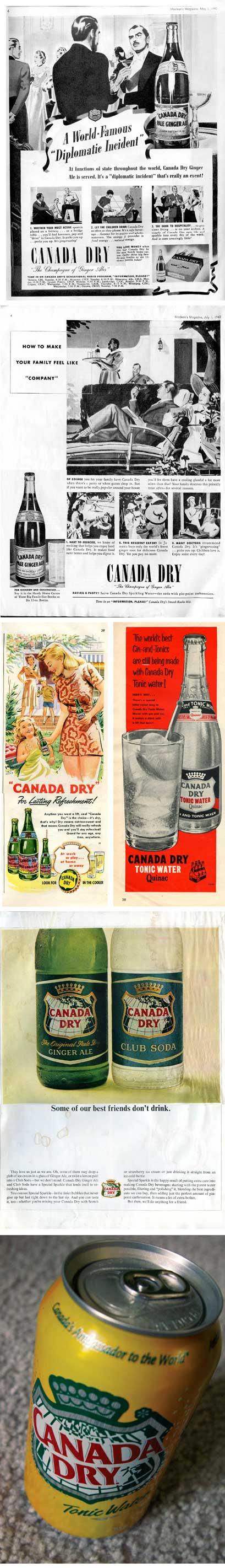


The evolution of the Canada Dry brand began as the name would suggest, in Canada, by pharmacist John McLaughlin in Toronto, in 1904. The Pale Ginger Ale, as it was known began as a medicinal remedy, and later as a beverage to be enjoyed on its own or as a mixer for alcoholic drinks. In 1907, it was officially appointed to the Royal Household of the Governor General, adding the crown above the shield — an element seen in all variants of the logo around the world even today.
The original label design featured a map of Canada, and on the neck label, a shield featuring the shields of all the provinces. In the early 1920s, ownership passed from the McLaughlin’s to an American company, but they would maintain the Canadian imagery of the labels. The original design originated in the “nineteen-teens” and would be kept mostly unaltered through to the 1950s.
Ownership of the brand passed through several more soda manufacturers, and today it now rests with Cadbury-Schweppes internationally, and Dr.Pepper/7-Up in the US. Until only very recently, the imagery of Canada had been maintained in the brand around the world; but since 2002 in the US for instance, the reference to the map of Canada has been completely done away with. In Canada however, the use of the map still persists.
Shown here are some ads with the original design, plus some more ads from later that show the progression of the brand, ending with what a Canadian Canada Dry can looks like today.
Dates of Ads (from top)
Maclean’s, May 1, 1940
Maclean’s, July 1, 1940
Maclean’s, July 1, 1949 (left)
Maclean’s, July 9, 1955 (right)
LIFE, January 8, 1965
Canada-specific Can. Photographed August 2007.

Came across this tin sign, loved the campaign!
-TF